
Color combinations
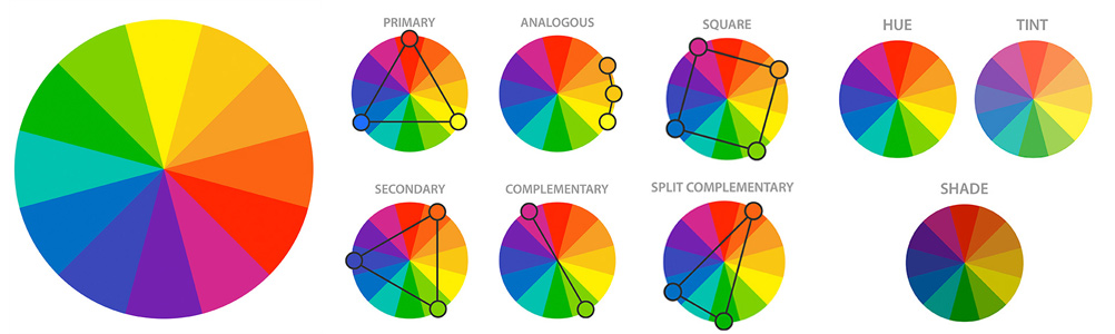
Once the color psychology is decided, it's easy to choose colors that go together. With a color wheel, you can quickly select monochromatic, complementary, analogous, split color combinations, triads or tetrads. These different color schemes guide your choices between selecting contrasting colors and harmonious colors, depending on the desired effect you want to achieve.
Monochromatic combinations
A monochromatic color scheme is different variations of a single shade. This combination consists of varying the tints, shades and tones of the chosen tone. For example: dark blue, slightly lighter blue, and light blue. These combinations are excellent for simplifying busy designs and creating a harmonious and visually attractive appearance. It's a great color scheme strategy if you want your brand to be identified with a particular color. It is also useful for showing progression in a design, such as a tiered price list, or for creating a more sophisticated looking design using a brighter color.</p >
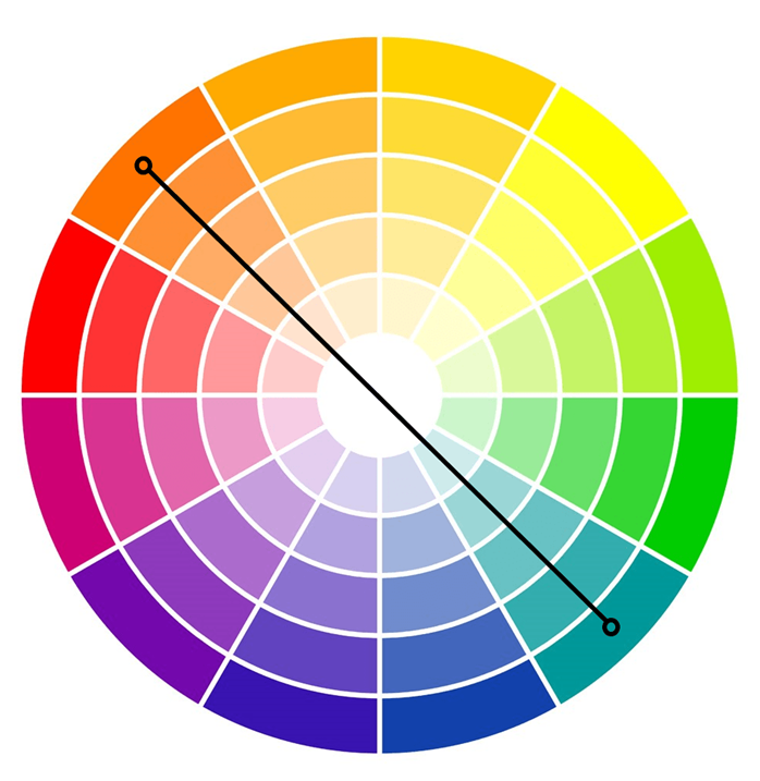
Complementary combinations
Complementary colors exist directly across from each other on the color wheel. These colors have a high contrast between each other. and they can make your design stand out boldly with high contrast. However, if used incorrectly, they can be visually jarring.
Generally speaking, when you use complementary colors, you don't want to use them equally in your design. You want to choose one of the shades as your main color, then use the complementary color to highlight and make certain important elements stand out.
These contrasting color schemes can also be found in nature and can give a vibrant, yet natural feel to a design. Take, for example, the orange coral that stands out against the blue of the ocean, or the lavender against the soft green of the foliage.
Examples of complementary color combinations:
- Red and green.
- Blue and orange.
- Yellow and purple.
- Yellow-green and red-purple.
- Red-orange and blue-green.
Above is an example of a complementary combination: blue and orange. Notice how they are directly across from each other on the color wheel.
The most basic type of color harmony is complementary. Pick a color, and then see what it looks like. The color is directly opposite it on the color wheel. Those two are complementary colors. Complementary colors are colors that contrast strongly with each other, thus that when used together in a logo, both colors are bold and eye-catching.
Choosing complementary colors for your logo keeps your palette simple, but with simplicity comes limits. You only have two colors to work with: two bold, contrasting colors.
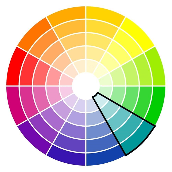
Analogous Combinations
These color combinations sit directly next to each other on the color wheel. Harmonious blends evoke serenity and peace. Some say this is because of the analogous combinations that exist so frequently in the natural world. It is recommended to choose a primary color as a base, then choose two more to highlight. This usually works best with a secondary and tertiary color. Make sure your base color dominates and that the other two colors stand out, not overwhelm. Also, be careful when choosing colors that are too closely related, as they can blend together and wash out your design.
Examples of analogous combinations:
- Violet, blue and teal.
- Red, fuchsia and purple.
- Red, orange and yellow.
- Green, blue and purple.
This type of palette creates a drastically different effect from the other types we have discussed so far. Since it is drawn from colors that are closely related, you don't get the level of contrast that you get with colors from opposite sides of the color wheel. However, there is still some contrast, and you can play with it by trying different shades and tints of the colors you have chosen. The end result is a less extreme palette that's perfect for brands looking for a more subtle look.
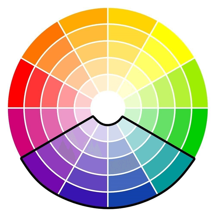
Split complementary combinations
This is a variation of the complementary color scheme. However, instead of two colors directly facing each other, this combination is made up of one color and the colors on either side of it complement. This strategy adds more variety than complementary color schemes by including three shades, without being too jarring or too bold. With this method, we obtain combinations that include warm and cool tones that balance more easily than those of complementary color schemes.
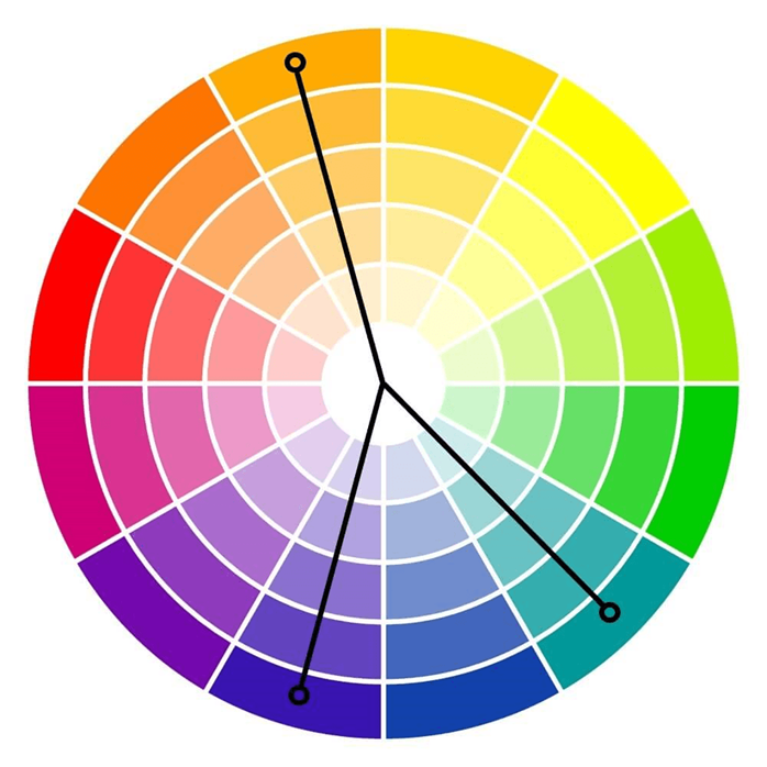
Examples of split complementary color schemes:
- Red, greenish blue and greenish yellow.
- Blue, red-orange and yellow-orange.
- Yellow, blue-purple and red-purple.
- Purple, yellow-orange and yellow-green.
Triadic combinations or triadic trios
These simple color combos are variants of the split complementary color scheme. The colors in this composition are equidistant on the color wheel. Take an equilateral triangle and place it on the color wheel. The colors at each point come together to make the triadic combination.
These color combinations tend to be quite vibrant, even when toned down, tinted or shaded. The colors may look playful or adolescent. Because of this, you will need to Be careful with the balance of these colors. Choosing one as the main color and using the other two as accents is a good starting point.
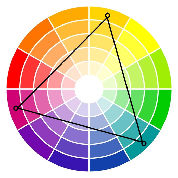
Examples of triadic combinations:
- Red, yellow and blue.
- Purple, green and orange.
- Blue-purple, red-orange and yellow-green.
As a complementary color palette, a triadic has high contrast and can be a great way to create a varied and colorful logo. And because there are three colors to play with, instead of just two, you can do more with a triadic palette, like illustrate a more complex image or communicate more points about your design.
Tetradic combinations or tetradic teams
Like the triadic color scheme, the tetradic color scheme involves colors that are equidistant from each other. Except these color combos use four colors instead of three. You can find a tetradic combination by placing a square on the color wheel and choosing colors in each corner, or by choosing two opposite sets of complementary colors.
These color combinations are always bold and fun, and the vibrancy makes the designs stand out. However, care must be taken when finding balance with these combinations because they can easily be overwhelming.
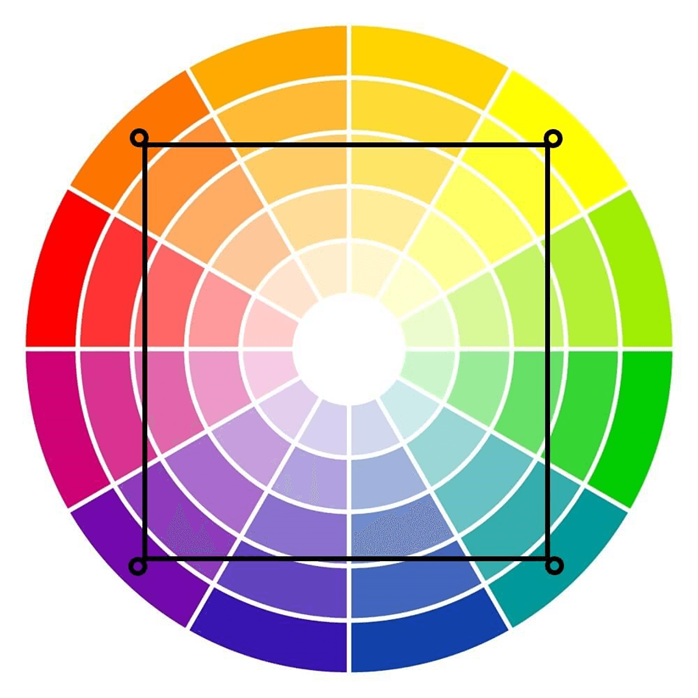
Examples of tetradic color schemes:
- Red, green, blue-purple and yellow-orange.
- Yellow, purple, blue-green and orange-red.
You could choose red and green and purple and yellow. Together, these four colors are powerful. They are bold, they have initial contrasts and when you have all four in one palette, the palette can look quite busy
One color, one palette
An analog palette may seem limited, but in reality, you have another, even more limited option: a monochrome palette. As the name implies, a monochromatic palette is a palette that only has one color.
Which, by definition, is not really a color palette ...right?
Actually, it can be. With the help of white, black and gray, you can create an entire palette using just one base shade.
By using a single color and building a palette by lightening, darkening or washing it, you can create a complex logo with a deep and cohesive look. This type of palette is often a great choice for brands that have a clear, singular mission and brands that want to keep their logos simple without settling for simplistic.
But what about the other colors?
As you may have noticed, we have not yet mentioned some important colors:
• Black
• White
• Brown
• Grey
Sure, we mention shades, shades and tones, but we don't mention black, white or gray by themselves. alone. And the word "brown" has not been mentioned at all.
Here it is The scoop on these shades: they are not like other colors. Black and white do not have specific wavelengths like the colors on the color wheel, making it impossible for them to fit on the color wheel. But, although some sources say that they are not technically colors, this does not tell the whole story.
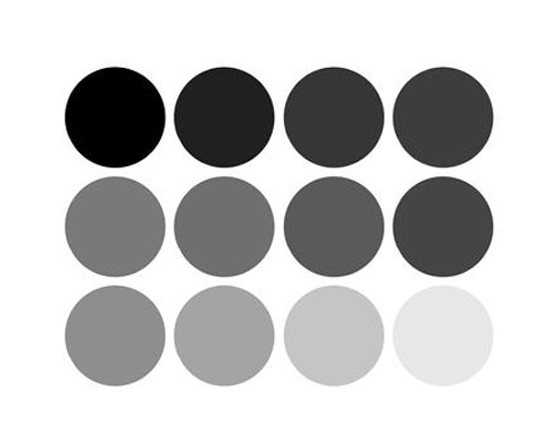
Grayscale palette
For designers, black, white and gray are colors. They do not fit into specific color harmonies, but can be used effectively in logos as the primary color or an accent color.
Similarly, brown does not fit into specific color harmonies. it is on the color wheel. But that doesn't mean it's not a color. Brown is the color you get when you mix two complementary colors. Red + green = brown, just like yellow + purple and blue + orange.
And, like black, white, and gray, brown doesn't fit into any of the specified color harmonies we discussed above, but it can be an effective color choice for your logo. , either as its main color or one of your tone or undertone choices.
Experimentation is key
Unless you have a natural affinity or background in art and design, choosing the best color combinations can be a little overwhelming at times. You won't really know what your chosen color combinations will look like in your design until you actually apply them. That's why experimenting with different hues, tones, shades and undertones can help you find the best color combinations for your equine design.
- visits: 22113
- 25-08-2018
- DIY
Last entries
How do you know what year a Barbie is?
This is the great dilemma that many collectors or non-collectors face when they want to date a Barbie doll. Many people mistakenly believe that just by looking at the date on the body or the date on the...
Read more
Colors in several languages
To be able to sell or buy miniatures, hair for reroot, paints for repaint, etc. At an international level, sometimes it is difficult for us to understand the colors of the item, that is why I have thought...
Read more
Wool Hair for dolls
Wool hair can be purchased from doll hair suppliers. Pure wool is obtained from sheep. This type of "hair" looks and acts like mohair. This type of "hair" is ideal for more ethereal creations such as fairies,...
Read more
 See on Amazon

